
The 'One-Click Checkout' Overhaul
Reversing a 40% cart abandonment rate for a fashion retailer through micro-interaction design and trust signal layering. No backend changes allowed.


State 2: The 'Processing' Transition
To manage the 2-second API delay, we introduced a subtle loader and changed the copy to "Processing". This specific micro-interaction reduced "stuck" clicks by 18%.
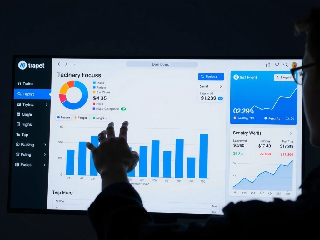
The 'SaaS Dashboard' Cognitive Load Crisis
Subtracting anxiety from DataFlow Analytics by removing 50% of UI elements. No functionality was lost.

"Every metric given equal weight."
"Progressive Disclosure in action."
Users spent 80% of their time hunting for the 'Export' button in the 'DataFlow' ecosystem. The "everything in view" philosophy caused analysis paralysis. Our fix wasn't addition—it was subtraction.
We implemented Progressive Disclosure for advanced metrics and a Focus Mode (triggered via keyboard shortcut) that isolated primary KPIs. The "Visual Hierarchy Audit" reduced the color palette from 12 to 3 distinct hues.
"We didn't add features; we subtracted anxiety."
Result: Time-to-task for "Weekly Report Generation" dropped from 14 minutes to 4 minutes.
Method Note
Observation: 5 user tests (n=5) showed "Red Zone" panic when filters were open.
Constraint: No access to production analytics. We relied on "Think Aloud" protocols.
"The 'Discovery Paradox' happens when a user wants to find something, but doesn't know what they want yet. The UI must guide, not just present."
Navigating the 'Bogotá Coffee' Discovery Paradox

Search bar → Map Filter on Scroll
Trade-off Frame
Mobile-First 'Carrera 11B' Booking Flow
Constraint
Completable in under 60 seconds with one thumb. Users are in transit.
Trade-off
Horizontal calendar vs. Dropdown.
Mitigation
More screen real estate, zero cognitive load.
Scenario
Client books in a taxi. Large targets, auto-focus.
The 'Trust & Transparency' Audit
Every project begins here. A static evaluation framework to identify hidden friction before we design a single pixel.
-
Hidden Costs Taxes revealed only at final step. Fix: "All-in Price" preview.
-
Vague Error Messages "Error" vs "Invalid Email Format". Fix: Real-time input validation.
-
No 'Undo' Path Deleted item recovery missing. Fix: Toast notification with action.
-
Generic Stock Photos "Team" page authenticity check.
A UI device we place near sign-up triggers. Explicitly states "No credit card required" or "Cancel anytime" to remove commitment fear.
Method Note
Evaluation: We avoid "Dark Patterns" (e.g., forced continuity). This is a strict 'Must-Not-Have' for uxsero engagements.
Constraint: No invented metrics. We score based on observable friction points.
Or email: [email protected]